How does responsive web design impact website traffic?
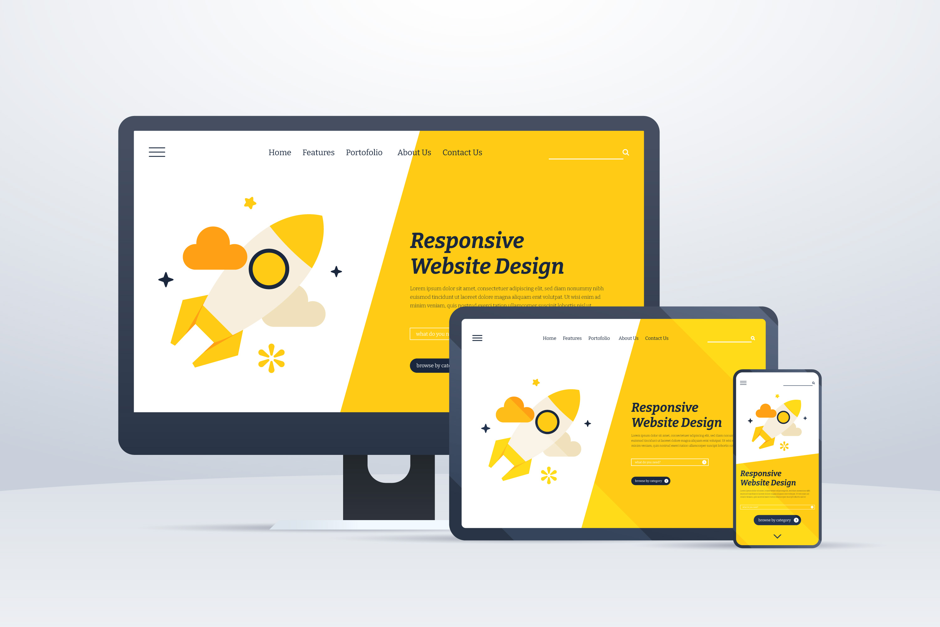
Responsive web design has become an essential component of modern web development, influencing the user experience and significantly impacting website traffic. With the proliferation of various devices and screen sizes, ensuring that a website is accessible, visually appealing, and functional across multiple platforms has become imperative for businesses aiming to maximize their online presence and engage a broader audience. This comprehensive guide will explore the profound impact of responsive web design on website traffic and delve into the key benefits and best practices associated with this dynamic approach.
Understanding Responsive Web Design
Responsive web design is a design approach that enables a website to adapt and respond seamlessly to the user's device and screen size, ensuring optimal viewing and interaction across all platforms. This adaptive design philosophy allows for the fluid adjustment of content, images, and layout elements to provide an intuitive and user-friendly experience, regardless of whether the user is accessing the website on a desktop computer, laptop, tablet, or smartphone.
Key Impact of Responsive Web Design on Website Traffic
Enhanced User Experience: By providing a consistent and user-friendly interface across different devices, responsive web design contributes to an improved user experience. Users can navigate the website seamlessly without encountering display or functionality issues, increasing user satisfaction and engagement. A positive user experience encourages visitors to spend more time on the website, explore multiple pages, and return for future interactions, thereby driving higher website traffic and reducing bounce rates.
Improved Accessibility and Reach: Responsive web design ensures that a website is accessible to a broader audience, including users with various devices and screen sizes. By accommodating different browsing preferences and behaviors, businesses can expand their reach and engage users across multiple platforms, increasing website traffic from diverse sources. Enhanced accessibility fosters inclusivity and allows companies to cater to a broader demographic, fostering a more extensive and engaged user base.
Search Engine Optimization (SEO) Benefits: Search engines prioritize responsive websites in their search results, as responsive design offers a consistent user experience and eliminates the need for separate mobile and desktop versions of the website. By improving the website's visibility and ranking in search engine results pages (SERPs), responsive web design enhances organic traffic. It increases the likelihood of users discovering and accessing the website through relevant search queries, ultimately driving sustained website traffic and improving online visibility.
Reduced Bounce Rates and Improved Conversion Rates: Responsive web design minimizes the risk of users encountering display issues or experiencing navigation difficulties, resulting in lower bounce rates and higher engagement levels. A seamless and intuitive user experience encourages users to explore the website's offerings and facilitates a smooth transition through the conversion funnel. With improved user engagement and reduced barriers to interaction, responsive design can lead to improved conversion rates, driving more qualified leads and facilitating increased website traffic from users who are more likely to convert into customers or subscribers.
Competitive Advantage: In an increasingly competitive digital landscape, businesses prioritizing responsive web design gain a competitive edge over non-responsive or outdated websites. By providing a superior user experience and accommodating diverse user preferences, businesses can differentiate themselves from competitors and position their brand as forward-thinking, customer-centric, and technologically adept. This competitive advantage can contribute to increased brand recognition, customer loyalty, and sustained website traffic, fostering long-term growth and success within the industry.
Best Practices for Implementing Responsive Web Design
To fully harness the benefits of responsive web design and optimize website traffic, businesses should adhere to the following best practices:
Mobile-First Approach: Prioritize the development of the mobile version of the website to ensure a seamless and optimized experience for mobile users. Design with a mobile-first mindset, considering the constraints and capabilities of mobile devices and progressively enhancing the design for larger screens and devices.
Flexible and Fluid Layouts: Implement flexible and fluid layout structures that adapt to various screen sizes and resolutions. Utilize CSS media queries to adjust the layout and content presentation based on the user's device, ensuring the website maintains its visual appeal and functionality across different screen sizes.
Optimized Images and Media: Optimize images and media files to reduce load times and accommodate varying bandwidths and device capabilities. Utilize responsive image techniques, such as the attribute and the picture element, to deliver appropriately sized images based on the user's screen size and resolution, improving overall page performance and user experience.
Intuitive Navigation and Interaction: Create intuitive and user-friendly navigation menus and interaction elements that are easily accessible and functional on both desktop and mobile devices. Prioritize touch-friendly design elements, intuitive gestures, and simplified navigation structures to facilitate seamless interactions and encourage users to explore the website's content effortlessly.
Consistent User Interface (UI) Elements: Maintain a consistent user interface across all devices to provide a cohesive and familiar user experience. Ensure that UI elements, such as buttons, forms, and interactive components, are standardized and optimized for different screen sizes, maintaining visual consistency and usability across various devices and platforms.
Content Prioritization and Simplification: Prioritize essential content and simplify the presentation of information to accommodate smaller screens and limited space on mobile devices. Utilize concise and clear messaging, minimize text-heavy content, and prioritize key information to enhance content readability and comprehension across all devices, thereby improving user engagement and driving increased website traffic.
Performance Optimization: Optimize website performance by minimizing HTTP requests, leveraging browser caching, and reducing server response times. Implement performance optimization techniques, such as GZIP compression, minification of CSS and JavaScript files, and content delivery network (CDN) integration, to improve page load times and enhance overall user experience, consequently increasing user engagement and driving sustained website traffic.
Cross-Browser and Cross-Device Compatibility: Ensure cross-browser and cross-device compatibility to guarantee a consistent and seamless experience for users across different web browsers and operating systems. Conduct comprehensive testing on various devices and screen sizes to identify and resolve any display or functionality issues, ensuring that the website remains accessible and functional for all users, irrespective of their preferred devices or browsing environments.
Regular Monitoring and Performance Evaluation: Continuously monitor and evaluate the performance of the responsive design to identify any usability or functionality issues. Utilize web analytics tools to track user behaviour, measure engagement metrics, and assess the impact of responsive design on website traffic and user interaction. Implement regular updates and refinements based on user feedback and performance data to ensure that the responsive design meets user expectations and drives sustained website traffic over time.
In conclusion, responsive web design serves as a cornerstone for enhancing user experience, expanding online reach, and driving increased website traffic. By prioritizing user-centric design principles, implementing best practices for responsive web design, and continuously evaluating and optimizing the user experience, businesses can establish a strong online presence, foster sustained user engagement, and drive organic traffic from diverse sources. Embracing the transformative potential of responsive web design is integral to building a robust digital presence, cultivating customer loyalty, and positioning the business for long-term success and competitiveness within the ever-evolving digital landscape.
These resources provide additional insights into how you can improve your website’s ranking on Google:
The Role of Website Design in SEO Success
How to Build a Search Engine-Friendly Website?
Signs of Bad SEO Practices on Your Website?
Unlimited Exposure Online, a well-regarded online marketing agency located in Toronto, has built a strong reputation over the course of 25 years. They are widely recognized as leaders in the field and have an impressive portfolio that encompasses the successful development of more than 1400+ websites.
Unlimited Exposure Online is dedicated to delivering affordable web development solutions that boost brand visibility. They accomplish this by strategically incorporating Local SEO services in Toronto and harnessing the potential of social media marketing techniques.
