Your Website Might Look Fine to You, But Confusing to Customers
A website can look modern, professional, and “good enough” to a business owner while still quietly losing customers every day.
Why?
Because most visitors decide within seconds whether they understand your business, trust your company, and know what to do next.
If your website creates even small moments of confusion, people often leave without calling, booking, or buying.
And in competitive cities like Toronto, that confusion can quietly cost businesses a surprising amount of revenue.
Table of Contents
Why “Good Looking” Websites Still Lose Customers
Most business owners think website problems are obvious.
They expect things like:
-
broken pages
-
outdated designs
-
technical errors
-
ugly layouts
But honestly?
The biggest website problems today are usually psychological.
The website technically works.
The design looks decent.
The business owner likes it.
Yet customers still leave.
That’s the dangerous part.
Because when a website “looks fine,” businesses rarely realize usability might actually be hurting conversions.
And modern customers make decisions incredibly fast now.
Especially on mobile.
Sometimes within 5 to 10 seconds.
If visitors quickly feel confused, overwhelmed, or uncertain, they usually don’t complain.
They just leave quietly.

The 5-Second Website Test Most Businesses Fail
Here’s a simple question:
If someone lands on your website for the very first time, can they instantly understand:
-
what you do?
-
who you help?
-
where you operate?
-
how to contact you?
-
why they should trust you?
Because most visitors are not carefully reading your website.
They’re scanning it.
Fast.
Especially on phones.
And if your homepage feels cluttered, confusing, slow, or unclear, hesitation starts immediately.
Visitors begin thinking:
-
“Wait, what exactly do they offer?”
-
“Do they serve my area?”
-
“Where’s the pricing?”
-
“How do I book?”
-
“Why does this feel complicated?”
-
“Should I just check another company instead?”
That hesitation matters more than most businesses realize.
Because confusion kills conversions.
Sometimes small website confusion issues are harder to notice from the inside.
A professional website review can often uncover friction points businesses stop seeing over time especially on mobile and local search.
Why Business Owners Stop Noticing Website Problems
This part surprises many companies.
The longer you stare at your own website, the harder it becomes to see its problems.
Your brain already understands everything:
-
your services
-
your process
-
your pricing
-
your terminology
-
your navigation
Customers don’t.
That creates a huge disconnect.
A contractor might fully understand their service categories.
A clinic owner may instantly recognize treatment names.
An HVAC company may assume industry wording is obvious.
But new visitors are seeing everything for the first time.
And first-time visitors experience websites very differently than business owners do.
Fresh eyes notice friction immediately.
That’s why many businesses across the GTA unknowingly create websites that feel clear internally but confusing externally.
The Hidden Cost of Confusing Navigation
A lot of websites become harder to use over time without businesses realizing it.
Usually because new pages keep getting added:
-
another service page
-
another dropdown menu
-
another banner
-
another button
-
another popup
Eventually the website starts feeling mentally exhausting.
And mentally exhausted visitors rarely convert.
Common Navigation Problems That Hurt Conversions
Too Many Menu Options
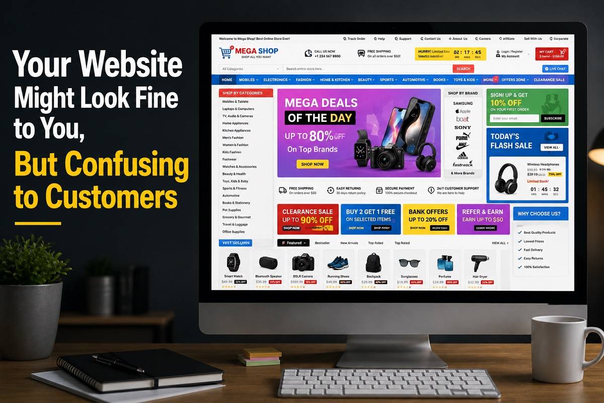
When visitors see 10 to 15 menu tabs, decision fatigue begins immediately.
People do not want to “study” your website.
They want quick answers.
Industry Jargon
This is incredibly common in:
-
medical aesthetics
-
legal services
-
wellness
-
construction
-
digital marketing
-
HVAC
Businesses often use terminology customers don’t fully understand.
Clear language almost always performs better than technical wording.
Important Information Is Hidden
Many businesses accidentally hide:
-
pricing
-
booking pages
-
contact buttons
-
service areas
-
FAQs
without realizing how much friction that creates.
Customers should never have to hunt for basic information.
Too Many Clicks
Modern users are impatient.
If visitors have to click through multiple pages just to understand your services, many simply leave.
What Customers Actually Want from a Website
This is where businesses often overcomplicate things.
Most customers are not looking for a “perfect” website.
They’re looking for reassurance.
They want to feel:
-
comfortable
-
confident
-
informed
-
safe contacting you
That’s it.
The highest-converting websites are often not the fanciest ones.
They’re simply easier to understand.
A strong website usually feels:
-
simple
-
organized
-
trustworthy
-
easy to navigate
-
easy to contact
-
clear about what happens next
Ironically, simplicity often converts better than flashy design.
Why Mobile Experience Quietly Changes Everything
A website can look completely fine on desktop, then feel frustrating on mobile.
And today, mobile experience affects almost everything:
-
SEO
-
Google rankings
-
bounce rates
-
customer trust
-
conversions
-
engagement
In cities like Mississauga, Vaughan, and Richmond Hill, many customers now discover businesses through:
-
Google Maps
-
mobile searches
-
voice searches
-
AI-generated search results
That means users often arrive on websites quickly and impatiently.
If the mobile experience feels:
-
slow
-
cramped
-
cluttered
-
confusing
they often leave before reading properly.

Voice Search and AI Search Are Changing Websites Too
Search behavior is changing rapidly.
People no longer only search like this:
-
“HVAC company Toronto”
Now they search conversationally:
-
“Best HVAC repair near me”
-
“Website design company in Toronto”
-
“Best clinic for natural Botox results”
-
“Restaurant open near me right now”
That changes how websites need to be written.
Google AI Overviews and AI search engines now prioritize:
-
clear answers
-
conversational wording
-
natural language
-
helpful explanations
-
structured information
Confusing Websites Hurt SEO Too
A lot of business owners think usability and SEO are separate things.
They’re deeply connected now.
Google increasingly measures:
-
user behavior
-
engagement
-
mobile usability
-
bounce rates
-
page experience
-
clarity
If users quickly leave your website, Google notices.
If visitors struggle to navigate, Google notices.
If mobile usability feels frustrating, rankings can slowly suffer too.
Modern SEO is no longer just about keywords.
Now it’s also about:
-
structure
-
readability
-
customer experience
-
trust
-
usability
That’s why many “SEO optimized” websites still fail to generate real business.
Sometimes the problem is not getting found online.
It’s what customers experience after they find you.
That’s why many GTA businesses are now focusing more on clarity, usability, and conversion-focused website improvements not just traffic.
Website Statistics Businesses Often Ignore
Here are some website behavior statistics that explain why clarity matters so much:
-
Nearly 53% of users leave websites that take too long to load
-
Most visitors form a trust impression within seconds
-
Mobile users are significantly more likely to abandon cluttered pages
-
Clear calls-to-action can dramatically improve conversions
-
Confusing navigation quietly increases bounce rates
These small usability issues add up fast.
Especially in competitive industries.
The Problem with Too Much Information
Many businesses are afraid of looking “too simple.”
So, they overload pages trying to prove credibility.
Huge paragraphs.
Too many animations.
Too many banners.
Too many buttons.
Too many service descriptions.
But too much information often creates anxiety instead of trust.
Especially for already-stressed customers.
This happens constantly with:
-
clinics
-
contractors
-
restaurants
-
law firms
-
home service businesses
Sometimes simplifying a website improves conversions far more than redesigning it.
Because customers stop feeling overwhelmed.
What People Secretly Look for Before They Trust a Business
Customers compare businesses faster than ever now.
That means trust signals matter a lot more than many companies realize.
Small Trust Signals That Quietly Affect Decisions
-
real business photos
-
clear contact information
-
updated content
-
Google reviews
-
fast-loading pages
-
professional but human wording
-
clear service areas
-
easy booking options
-
consistent branding
Even small inconsistencies create doubt.
And doubt slows decisions.
Quick Website Clarity Checklist
Ask yourself honestly:
Can visitors instantly understand:
-
what your business does?
-
where you operate?
-
who your services are for?
-
how to contact you?
-
what happens next?
If not, your website may be creating invisible friction.
What Many Toronto Businesses Get Wrong
A lot of businesses across Toronto and the GTA unknowingly copy competitors instead of focusing on customer behavior.
That creates websites where:
-
every clinic sounds identical
-
every contractor uses the same wording
-
every agency says “results-driven”
-
every restaurant uses generic descriptions
Eventually everything starts blending together.
The businesses that stand out online are usually not the loudest ones.
They’re simply clearer.
More human.
More understandable.
That difference matters more than most companies realize.
- Your Website Doesn’t Follow Up, AI Chatbots Do (And They Close More Than You Think)
- Beyond Aesthetics: Why a Slow Website is Your Competitor’s Best Friend
- Stop Posting, Start Converting: Why Your Internet Marketing Isn’t Bringing in Customers
- Google Knows You Exist, So Why Can’t Customers Find You? The Local Visibility Problem
Small Website Fixes That Often Improve Conversions
The good news?
Most businesses do not need a complete redesign.
Sometimes small usability improvements create major results.
Common Fixes That Help
Simplifying Homepage Messaging
Visitors should immediately understand:
-
what you do
-
who you help
-
where you operate
Improving Mobile Layouts
Cleaner spacing and easier navigation reduce frustration quickly.
Making Contact Actions Obvious
Customers should never wonder:
-
how to call
-
how to book
-
how to request information
Reducing Visual Clutter
Too many competing elements create mental fatigue.
Writing More Naturally
Human wording performs better than robotic corporate language.
Especially for AI search visibility and voice search optimization.
If your website feels “fine” but still struggles to generate consistent calls or leads, it may be worth looking at the customer experience more closely.
Unlimited Exposure Online helps businesses across Toronto and the GTA improve website clarity, local visibility, mobile usability, and conversion performance through practical, user-focused website strategies.
FAQs
Why does my website get traffic but not many calls?
Usually because visitors feel confused, overwhelmed, or unsure what to do next. Traffic alone does not guarantee conversions.
Does website usability affect SEO?
Yes. Google tracks user experience signals like mobile usability, engagement, bounce rates, and page experience.
How do I know if my website is confusing customers?
If visitors leave quickly, struggle to book, ask repetitive questions, or stop responding after visiting your site, confusion may be part of the problem.
What is UX optimization?
UX optimization focuses on improving user experience by making websites easier to understand, navigate, and use.
Why do customers leave websites so quickly?
Most users scan websites instead of reading carefully. If they cannot quickly understand what a business does or how to contact them, they often leave within seconds.
Do businesses always need a full website redesign?
Not always. Many websites improve significantly through small changes like simplifying messaging, improving navigation, or optimizing mobile usability.
Are AI search engines changing website design?
Absolutely. AI-driven search systems prioritize clear, conversational, well-structured content that answers customer questions naturally.
Final Thoughts
A confusing website rarely announces itself loudly.
Usually it hides quietly behind:
-
low conversions
-
inconsistent leads
-
short website visits
-
fewer calls
-
customer hesitation
And because the website still “looks fine,” businesses often blame:
-
marketing
-
ads
-
SEO
-
competition
when the real issue is clarity.
Customers feel confusion immediately.
Especially on mobile.
Especially in competitive local markets.
The good news?
Most of these problems are fixable once businesses start viewing their websites through customer eyes instead of owner eyes.
If your website gets traffic but visitors still hesitate to call, book, or trust your business, sometimes the issue is not visibility.
Sometimes it’s usability.
And small improvements in clarity can completely change how customers respond online.
About Unlimited Exposure Online
Established in 1997, Unlimited Exposure Online is a Toronto-based digital marketing and web development agency helping businesses across Toronto and the GTA improve their online visibility, website performance, and customer experience.
As search behavior, AI platforms, and Google continue evolving, the agency focuses on helping businesses become easier to find, easier to trust, and easier to contact online not just generate traffic.
Services include website design, local SEO, Google Ads management, CRM integration, content marketing, chatbot integration, and AI-search-friendly optimization for businesses across Vaughan, Markham, Mississauga, and the Greater Toronto Area.
Book a friendly strategy calls no pressure, no jargon, just clear next steps for your business.
